One Question at a Time vs One Long Page: Which Form Gets Finished?
Conversational forms or one long page? What the research from Baymard, Zuko, GOV.UK and Nielsen Norman Group says, and which format fits which form.

Shaheer Malik
Framer Designer & Developer
Quick answer
One question at a time usually works better for forms people fill in once, such as surveys, bookings, applications and lead forms. One long page works better for short forms, frequent internal tasks and answers people need to compare. Asking fewer questions matters more than the layout: Baymard found most checkouts need 8 fields, not the 11.3 average.
One question at a time usually works better for forms that people fill in once, such as surveys, bookings, applications and lead forms, because each screen asks for one thing and the next step is obvious. One long page works better for short forms, forms people fill in often, and answers people need to compare. The number of questions matters more than the layout.
I design forms for client sites and I make Forms, a one-question-at-a-time form builder, so I have a stake in this. Every figure below links to its original source.
What is a one-question-at-a-time form?
It is a form that shows a single question per screen and moves forward when you answer. Typeform made the style popular. It is also called a conversational form, a wizard or a step-by-step form, and government services have used it for years.
The alternative is the classic single page: every field visible at once, one submit button at the bottom.
Which format gets more forms finished?
Neither format wins everywhere. What reliably helps is asking fewer questions, and asking them in a way people understand.
The clearest evidence is about length. Baymard Institute found that the average checkout in 2024 had 11.3 form fields over 5.1 steps, while most sites need only 8 fields. Baymard also found 17% of shoppers had abandoned an order because the checkout was too long or complicated. Splitting 11 fields across screens does not fix that; removing the 3 you don't need does.
Abandonment is common whatever the layout. Zuko's form analytics benchmarks put the share of people who start a form and don't finish it at 34%. Completion is also lower on phones: 47.01% of desktop form visitors convert, against 42.95% on mobile.
| Finding | Figure | Source |
|---|---|---|
| Average checkout form fields (2024) | 11.3 fields, 5.1 steps | Baymard Institute |
| Fields most checkouts actually need | 8 | Baymard Institute |
| Shoppers who abandoned over a long or complicated checkout | 17% | Baymard Institute |
| People who start a form but don't finish | 34% | Zuko |
| Form conversion, desktop vs mobile | 47.01% vs 42.95% | Zuko |
Why does one question at a time help?
Because each screen has one job. The GOV.UK Design System recommends asking one question per page by default. It says this helps users understand what you are asking them to do and focus on the question and its answer.
In practice that brings four benefits.
- Less to read at once. A long form shows its full length up front, and some people leave before typing anything.
- Better on phones. One question fits one screen, with a large tap target and no hunting for the next field. That matters when mobile already converts lower.
- Branching feels natural. Skipping questions that don't apply is invisible to the respondent, so everyone sees a shorter form.
- Accessibility. With the question as the page heading, GOV.UK notes, screen reader users hear it once instead of twice.
When is one long page better?
When people need to see everything, or do the task often. Nielsen Norman Group recommends step-by-step wizards for novice users and infrequent processes. It warns that they get tedious for repetitive tasks, make it hard to compare information across steps, and feel limiting for expert users.
- Very short forms. A newsletter sign-up with one email field gains nothing from steps.
- Forms people fill in daily. Internal data entry is faster when everything is visible and tabbable.
- Answers that depend on each other. If people need to check one answer against another, keep them on the same screen.
- Forms people print or review in full. Some forms are read before they are filled.
Which forms should use one question at a time?
Forms that people fill in once, care about getting right, or answer on a phone.
| Form | Best format | Why |
|---|---|---|
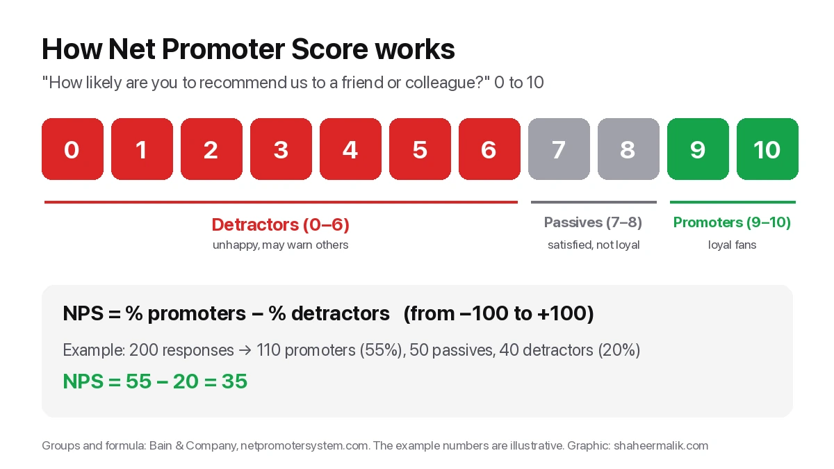
| Customer feedback and NPS surveys | One at a time | Ratings and follow-ups branch on the answer |
| Lead qualification and quote requests | One at a time | Logic shows only relevant questions |
| Bookings and orders with payment | One at a time | Clear steps before a card is charged |
| Job and programme applications | One at a time, in sections | Long, filled in once, often on mobile |
| Newsletter sign-up | Single field | Steps would only add clicks |
| Internal data entry | One page | Repetitive and done by experts |
How do I make a one-question-at-a-time form people finish?
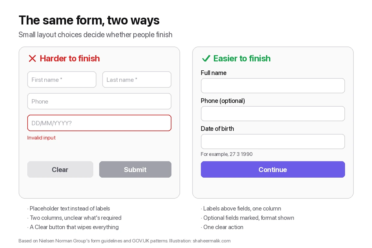
The format helps only if the questions are right. These are the rules I use on client forms.
- Cut questions first. Baymard's 11.3-versus-8 gap applies to every form: ask only what you will use.
- Start easy. Open with a question anyone can answer in a tap, not an email address or a budget.
- Use logic to skip. Branch so nobody sees a question that doesn't apply to them.
- Show progress. A progress bar or "3 of 6" answers the question "how long is this?"
- Let people go back. Editing a previous answer should be one tap away.
- Make it work from the keyboard. Letters to pick answers and Enter to continue keep desktop users moving.
- Measure drop-off by screen. The question where people leave is the one to rewrite or remove.
The same principles of clarity and hierarchy run through all good interfaces; my guide to web design fundamentals covers them beyond forms.
What tools make one-question-at-a-time forms?
Forms and Typeform show one question at a time by default, and Jotform has a card layout. Tally can do it if you add a page break after each question. My comparison of Typeform alternatives covers their prices and trade-offs, checked on 1 October 2026.
Does one question at a time make a form feel longer?
It can, if the form is long and gives no sense of progress. Ten screens with no indication of how many remain feel endless, even when a single page of the same ten fields would feel manageable.
Three things prevent it. Show progress, so people always know how far they are. Group tiny related fields, such as first and last name, on one screen instead of two. And keep each answer fast: a tap for a choice, a key press to continue. When most screens take two seconds, a ten-question form is over in under a minute.
If a form still feels long in testing, the fix is almost always fewer questions, not a different layout.
Last updated: 1 October 2026. Build your first form free, no card needed, or talk to me about your project.
FAQ
Frequently asked questions
Often, for forms people fill in once, such as surveys, bookings and applications, because each screen asks one thing and works well on phones. For very short forms, frequent internal tasks or answers people must compare, one page is better.
Want it done for you? I offer website design on a fixed price, from $700. See pricing.