Why Your Form Has a High Drop-Off Rate (and How to Find the Question)
High drop-off usually comes from one question, not the form's length. How to find it with a drop-off view, the common causes, and how to fix them.

Shaheer Malik
Framer Designer & Developer
Quick answer
A high form drop-off rate usually comes from one or two specific questions, not the form's length. Look at how many people reached each screen; the biggest fall marks the question to fix, often a phone number or an unclear required question.
A high form drop-off rate almost always comes from one or two specific questions, not the length of the form. Find them by looking at how many people reached each screen: the biggest fall between two screens marks the question to fix. The usual culprits are a phone number or other personal detail asked too early, a required question people can't answer, an unclear question, or a technical snag such as a file upload.
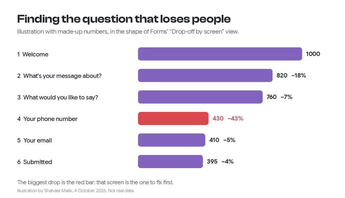
I make Forms, whose results include a drop-off view. The research figures come from Zuko and the Baymard Institute, read on 4 October 2026. The funnel chart below is an illustration with made-up numbers, not real data.
What is a form drop-off rate?
It's the share of people who start your form but leave before submitting. If 1,000 people see the first screen and 400 submit, 60% dropped off. A completion rate is the same number from the other side: 40% completed.
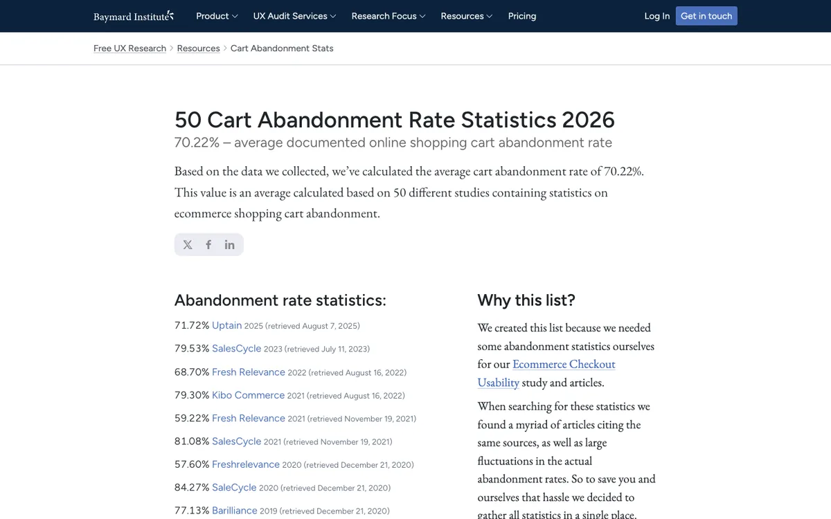
For context, the form analytics company Zuko reports in its benchmarking insights that 34% of people who start a form don't successfully complete it. The Baymard Institute, which studies checkout usability, puts the documented average online cart abandonment rate at 70.22% across 50 studies. It also found that 17% of US online shoppers have abandoned an order because the checkout was too long or complicated.

Is my form too long?
Probably not; it's more likely one question. One of Zuko's most surprising findings is that the number of fields made almost no difference to completion rates. People will answer a lot of easy, relevant questions. What stops them is a question that feels intrusive, confusing or impossible to answer.
That's why the useful number isn't your overall drop-off, but the drop at each screen.
How do I find the question people quit on?
Compare how many people reached each screen. A one-question-at-a-time form makes this precise, because every question is its own screen. In Forms, open Results, then Performance. The Drop-off by screen chart shows how many visitors reached each screen and highlights the biggest drop. It sits next to views and completion rate over time.

Read it like this:
- A steady small loss at every screen is normal. People drift away.
- One big fall (in the illustration, 43% at the phone number) is the problem. Fix that screen first.
- A big fall at the first screen means the welcome didn't convince people, or the form doesn't match what the link promised.
Why do people drop off at a question?
Here are the common causes, what they look like in the drop-off chart, and the fix:
| Cause | Where it shows | Fix |
|---|---|---|
| Personal details asked too early (phone, address, budget) | A cliff at that screen | Move it later, make it optional, or show it only when needed with logic |
| Required question people can't answer | A fall at a required question | Add "Not sure" or "Something else", or make it optional |
| Unclear or double question | Drop plus odd answers | Rewrite as one plain question; see writing better survey questions |
| Long typing on a phone | Drop at long text questions | Ask for a sentence, not an essay; offer choices first |
| Technical snag (file upload, payment) | Drop at that screen, often on mobile | Test on a real phone; make uploads optional where you can |
| Weak welcome or wrong audience | Big loss at screen 1 | Say what it's for, how long it takes and what people get |
Is drop-off worse on phones?
Usually a little. In Zuko's benchmarking, desktop sessions completed at 47.01% against 42.95% on mobile, and the gap was much wider for onboarding forms: 50.8% on desktop against 35.33% on mobile. Typing, file uploads and fiddly date pickers are all harder on a phone.
So when you find a cliff, check it by device. In Forms, Results can be filtered by device, as well as by answer, tag, ending and hidden field, and the same filters apply to the summary and exports. If the drop is mostly on phones, the fix is usually mechanical: a shorter text answer, choices instead of typing, or an optional upload. If it's the same everywhere, it's the question itself.
Traffic source matters too. A form shared in a newsletter reaches people who already trust you; the same form behind a cold ad doesn't. Add a hidden field such as source to each link, then compare drop-off by source before blaming the form.
What if people drop off at the last step?
A fall right before submitting is the most expensive kind, because those people did almost all the work. Look at what the last screen asks. It's often the contact details, a payment or a consent box with unclear wording. Explain why you need the detail, show the price earlier so the payment isn't a surprise, and make sure the button says what happens, such as "Send my request" rather than "Submit".
How do I fix it and know it worked?
Change one thing, then compare the same chart for the period after. A few fixes that work on most forms:
- Say how long it takes on the welcome screen, and make sure it's true.
- Start with an easy click, such as a choice, not a text box or an email field.
- Ask sensitive questions last, when people have invested in answering.
- Use conditional logic so people only see questions that apply to them.
- Make optional what you can live without. Every required field is a reason to stop.
- Explain why you ask when it isn't obvious: "We'll only call to confirm the booking."
Then watch the drop-off chart for a week or two. If the cliff moves to the next question, you've found a second problem; if it disappears, you've fixed the real one. My 15 form design rules cover the rest.
Last updated: 4 October 2026. Build your first form free, no card needed, or talk to me about your project.
FAQ
Frequently asked questions
It depends on the form, but Zuko's benchmarking found that 34% of people who start a form do not complete it, so finishing around two-thirds is typical. Compare your form with itself over time rather than with an average.
Want it done for you? I offer website design on a fixed price, from $700. See pricing.