Designing a Calm Health App: The Cafeity Case Study
How I designed Cafeity to be calm: trends instead of verdicts, labelled estimates, an AI that never computes a number, a one-page Visit Summary, and what I cut along the way.

Shaheer Malik
Framer Designer & Developer
Quick answer
Cafeity is a GLP-1 tracker for iPhone that I designed around one goal: calm. This case study covers the problem, the people it serves, five design principles, the Visit Summary, Ora the AI companion, the visual system, what I cut and how the app is built.
Last updated: 2 October 2026
Cafeity is an iPhone app I designed and built for people taking GLP-1 medicines such as semaglutide and tirzepatide. It keeps the details that matter in one place: doses and injection sites, food, symptoms, weight, water and protein. Then it turns them into a one-page summary for the next appointment.
This case study is about one design goal: calm. Health apps are full of red numbers, streaks and warnings. I wanted the opposite. It covers the problem, the principles, the features, the visual system, what I cut and how the app is built. It is written for founders and product teams designing anything that touches health.
| At a glance | Cafeity |
|---|---|
| What it is | A GLP-1 tracker for iPhone, a general wellness record |
| Launched | 21 September 2026 on the App Store; version 1.1.0 on 28 September |
| Core idea | Describe the record. Never judge it or advise on it. |
| Signature feature | The Visit Summary, one page for the prescriber |
| Stack | Expo and React Native, Supabase, optional AI with separate consent |
What problem was Cafeity designed to solve?
Cafeity was designed to stop the details of a GLP-1 treatment from getting scattered. Which day you injected and where. What you managed to eat. When the nausea hit. What the scale said. Those details live in notes apps, photos and memory, and they are exactly what a prescriber asks about.
Appointments are short. The app's listing calls the Visit Summary "built for the ten minutes you get with your prescriber". Everything in the design flows towards that page.
Who was it designed for?
The person I designed for is on a weekly or daily GLP-1 medicine, has a smaller appetite than they are used to, and has days when they feel rough. They do not want a coach. They want a record that is quick to keep and easy to read.
- The busy logger. Logging has to take seconds, or it stops happening.
- The anxious reader. A number on a bad day should never feel like a verdict.
- The appointment-goer. They need one page they can hand over, not twenty screenshots.
I also designed for a small phone. Screens were checked on the smallest current iPhone, because cramped layouts break calm faster than anything.
What does calm mean in a health app?
Calm is not a colour. It is a set of rules about what the app is allowed to say. These five decided most of the design arguments.
- Describe, never judge. No red warnings on food, no leaderboards and no "people like you".
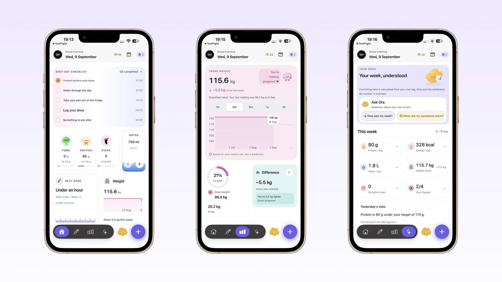
- Trends, not verdicts. Weight is shown as a smoothed trend, labelled "Based on your recent rate. Not a prediction." You can hide the numbers and see only the direction.
- Never pretend to be a clinician. The app never recommends, calculates or adjusts a dose, and never turns a symptom into a diagnosis.
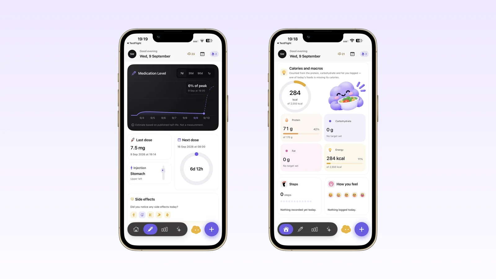
- Label every estimate. The medication-level curve says, on screen, "Estimate based on published half-life. Not a measurement."
- Streaks count showing up. They never demand perfection, and you can switch them off.
There are safety floors too. Energy targets and goal weights have minimums, so the app can never suggest something extreme.
How did the key features take shape?
Each feature started as a question: what is the calmest way to do this?
Logging in seconds
A dose repeats with one tap, with injection-site rotation and full history. Food can be a photo of the plate, a barcode, a search or a quick-add. Symptoms are written in the person's own words, with their own severity. Water and protein sit on the Today screen because they are the two people most often fall short on.
The Visit Summary
The Visit Summary is a print-ready PDF that the person chooses the contents of. Pick a period, such as four weeks or six months, and the sections to include: doses, the weight trend, measurements, symptoms, nutrition, sleep and notes tagged for the prescriber. Nothing is shared until they export it.
Designing one page was harder than designing ten. Every section had to earn its place, and every chart had to make sense printed in black and white.
Ora, an AI that never computes a number
Ora is the companion: a small cloud with a face. Its job is narrow. It describes what is in your record, in plain sentences. Language models are good at sentences and unreliable at arithmetic, so Ora never does arithmetic about you. The app calculates every figure from the log, hands Ora a block of facts, and checks the reply against those facts before it is shown.
Some questions never reach the model at all. Anything about changing, skipping or doubling a dose gets the same answer: that is a decision for your prescriber, here is what your log shows, and would you like it in your next Visit Summary? The AI features need their own consent, and the whole app works without them.
The Cycle View
Weekly medicines rise and fall across the week, and so do appetite and side effects for many people. The Cycle View shows an estimated medication level from the published half-life, with symptoms beside it. The hard part was honesty. The curve is clearly labelled as an estimate, because a smooth line looks more certain than it is.
What does the visual system look like?
The brand colour is a soft violet, #6C5CE7, set against lavender washes. It reads as calm and medical without looking clinical. Ora brings the only warm colour, so the character stands out wherever it appears.
| Decision | Why |
|---|---|
| Every colour is a token with light, dark and high-contrast values | Readable in bright kitchens, dark bedrooms and with accessibility settings on |
| 63 screens in Figma, all bound to tokens | One change updates every screen, so the app stays consistent as it grows |
| Soft tiles instead of hard cards | Grouped information without boxes shouting at each other |
| A mascot with moods | Ora can be resting, thinking or pleased, which softens empty states and errors |
| Generic medicine names only | Works for any GLP-1, and keeps the app about the person, not a brand |
What did I cut, and why?
Some of the best decisions were removals.
| Cut | Why |
|---|---|
| Dose calculators and anything that tells you what to take | Doses belong to the prescriber and pharmacist. The app records; it does not decide. |
| Comparisons with other people | Leaderboards and "people like you" turn a hard week into losing. Your record is only compared with itself. |
| Progress photos | Dropped in the rebuild. The app keeps body measurements instead, and the help, export and deletion screens were updated so nothing promises photos. |
| Brand names | Generic names keep the app neutral and useful whichever medicine someone takes. |
The rule I took away applies to every product I design now: if the app should not decide something, do not design a screen that looks like it does.
How is it built?
The first version was a native Swift app. Version 1.1 is a rebuild in Expo and React Native. Before it shipped, a parity check compared the new app with the old one across 30 categories, so people updating would not lose anything.
| Layer | Choice | Why it matters for a health app |
|---|---|---|
| App | Expo and React Native | Most fixes ship as over-the-air updates, without waiting for review |
| Data | Supabase Postgres with row-level security | The database itself enforces that each record belongs to one account |
| Health data | Apple Health reads for weight, measurements, steps and sleep | Less typing; the record fills in around what you log |
| AI | Google Gemini, behind a separate consent | Optional by design; declining it switches the AI off and the app still works |
| Purchases | RevenueCat for the Pro subscription | Reliable entitlements without building billing from scratch |
What are the results so far?
Cafeity launched on the App Store on 21 September 2026, and version 1.1.0 followed on 28 September. It is free to download, and Cafeity Pro is $12.99 a month or $79.99 a year. It is too early for meaningful usage numbers, and I would rather say so than invent them.
Alongside the app, cafeity.com grew into more than a hundred pages of guides, trackers and printable templates. Every figure on them links to its source, usually the medicine's US prescribing information, and the site uses generic names only. That content is how a new app gets found before it has reviews.
Lessons for anyone designing a health app
- Decide what the app will never say before you design what it says. The "never" list shaped more screens than any feature list.
- Label uncertainty on the screen, not in the terms. "Estimate" and "not a prediction" belong next to the number.
- Keep AI on a short leash. Let the app do the maths and the model do the sentences.
- Design the handover. A record is only useful if it fits in the time someone has to read it.
If you are building a health, wellness or care product, you might also like my EconoGlance case study on designing for trust with money, the peaflow medication reminders for families, and the Headlyne AI app. To talk about your product, see services or get in touch on the contact page.
Frequently asked questions
What is Cafeity?
Cafeity is an iPhone app for people taking GLP-1 medicines. It records doses and injection sites, food, symptoms, weight, water and protein, and turns them into a one-page Visit Summary for appointments.
Who designed Cafeity?
Shaheer Malik designed and built Cafeity. He is a Senior UI/UX Product Designer and Framer developer who has delivered more than 75 product, brand and Framer website projects.
What makes Cafeity a calm health app?
It describes your record without judging it. There are no red warnings on food, no leaderboards, weight is shown as a trend you can hide, estimates are labelled on screen, and streaks are optional.
Does Cafeity give medical advice?
No. It never recommends, calculates or adjusts a dose and never interprets a symptom as a diagnosis. Decisions belong to a prescriber.
How is Cafeity built?
Cafeity is built with Expo and React Native on a Supabase backend with row-level security. AI features use Google Gemini behind a separate consent, and purchases run through RevenueCat.
How much does Cafeity cost?
Cafeity is free to download. Cafeity Pro is $12.99 a month or $79.99 a year, with a free trial.
Last updated: 2 October 2026. Designing a health or wellness product? Talk to Shaheer on the contact page or book on Contra.
FAQ
Frequently asked questions
Cafeity is an iPhone app for people taking GLP-1 medicines. It records doses and injection sites, food, symptoms, weight, water and protein, and turns them into a one-page Visit Summary for appointments.
Want it done for you? I offer product design on a fixed price, from $700. See pricing.