Extract a color palette from an image
Drop any photo, logo or screenshot and get its dominant colours in seconds, grouped the way your eye sees them, with each colour's share of the image. Sample exact pixels with the eyedropper and export to CSS, Tailwind, JSON or a PNG swatch card.
- Free, no signup
- Runs in your browser
- Nothing is uploaded
Image
Click anywhere on the image to pick that exact pixel. Paste with ⌘/Ctrl + V.
Palette
Finding colours…
Colours
Order
Click a swatch to copy
Export
:root {

}
How it works
How to use the palette from image
- 01
Add an image
Drop a photo, logo or screenshot, browse for one, or paste straight from your clipboard. A sample photo loads first so you can see how it works.
- 02
Choose how many colours
Pick 3 to 10. Sort them by how much of the image each one covers, or from light to dark to check the range.
- 03
Pick exact pixels
Click anywhere on the image to sample that single pixel: a logo's blue, a highlight, the colour of a shadow.
- 04
Export
Click a swatch to copy it as HEX, RGB or HSL, copy CSS variables, a Tailwind v4 theme or JSON, or download the palette as a PNG.
How colour extraction works
A photo has hundreds of thousands of pixels and tens of thousands of distinct colours. Pulling a palette out of it means grouping similar pixels and naming each group with one colour. This tool does it in four steps:
- Downsample. The image is redrawn at about 120 pixels on its longest side, around 10,000 pixels. That is plenty to capture how much of each colour there is, and it keeps the maths instant.
- Convert to a perceptual colour space. In RGB, two blues can be numerically far apart and look identical, while a dark green and a dark brown sit close together. In OKLab, straight-line distance approximates how different two colours look, so groups match what you see.
- Cluster with k-means. The algorithm places k starting centres, spread out with the k-means++ method, assigns every pixel to its nearest centre, moves each centre to the average of its pixels, and repeats until nothing changes. A fixed seed makes the result repeatable.
- Measure the share. The number of pixels in each group becomes its percentage, which is what the palette bar shows.
Extraction methods compared
| Method | How it works | Good at | Weak at |
|---|---|---|---|
| Average colour | Mean of every pixel | A single tint for a placeholder | Usually returns mud |
| Median cut | Repeatedly splits the RGB colour box along its longest side (Color Thief uses a variant) | Speed, overall mood | RGB distances aren't perceptual |
| k-means in OKLab (this tool) | Iterative clustering in a perceptual space | Distinct, faithful groups with real shares | Small accents can be absorbed |
| Eyedropper | Reads one pixel | Exact values from flat areas and logos | Noise, compression, edges |
From a photo to a brand palette
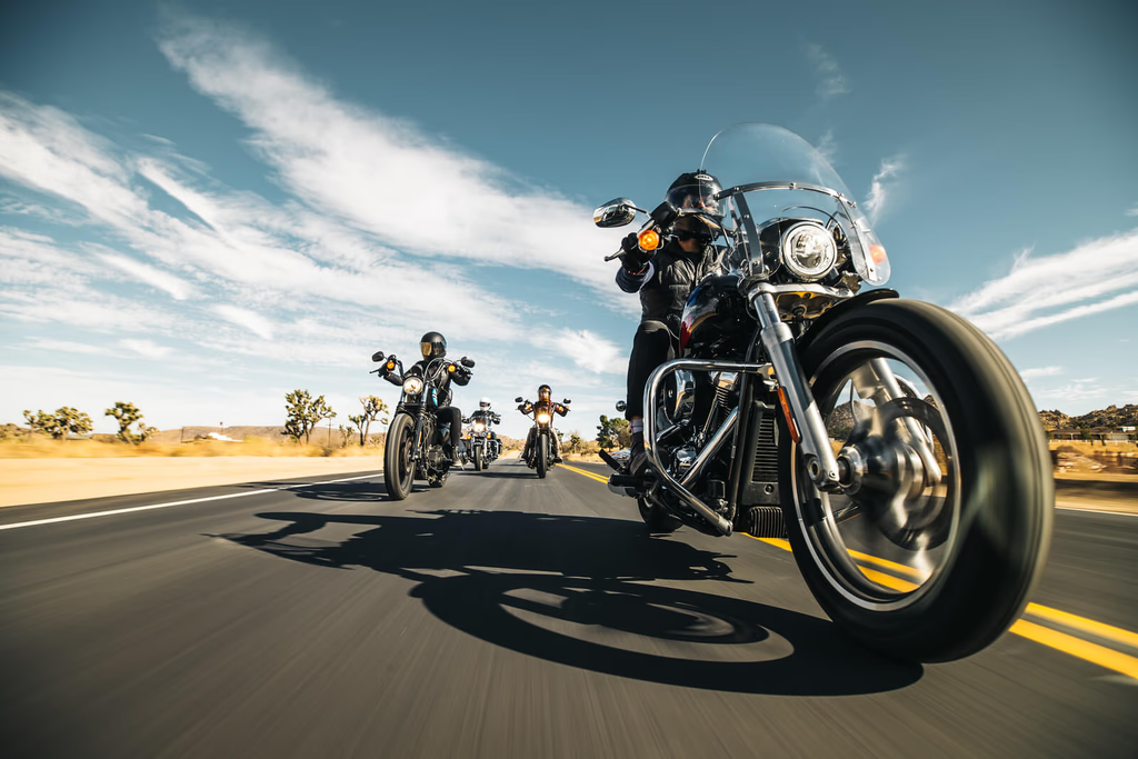
An extracted palette is a mood, not yet a system. A photo of a desert road gives you sky blue, sand, asphalt grey and a stripe of yellow. Turning that into something a website can use takes a few decisions:
- One neutral, usually the largest muted group, for backgrounds and surfaces.
- One primary, the most saturated colour that still feels like the image. It carries buttons, links and focus states.
- One accent, used sparingly. The old 60-30-10 rule of thumb (neutral, primary, accent) is a reasonable starting split.
- Full scales. A website needs light tints for backgrounds and dark shades for text, so expand each colour with the Tailwind colour scale generator.
- Contrast checks. Photo colours are mostly mid-tones, which rarely pass as text. Test every text pair with the contrast checker.
That is the core of a brand identity colour system. Write the rules down in a style guide so the palette survives contact with the next ten people who touch it.
Getting better results
- Crop to the subject. A huge sky or white background will take most of the palette. Crop first if you care about the product, not the scenery.
- More colours for accents, fewer for mood. Three to five colours capture the overall feel; eight to ten surface the small details.
- Screenshots give exact values. Interfaces are made of flat colours, so clusters land on the real hex codes. Photos give averages.
- Sort light to dark. A usable palette spans the range. If everything sits in the middle, you will need to add a near-white and a near-black.
- Expect small differences. Browsers convert images with embedded colour profiles, such as Display P3 photos from phones, to sRGB when reading pixels, so values can differ slightly from a design app working in a wider gamut.
This is a color palette from image extractor that runs entirely on your device, so it is safe for unreleased product shots and client work. When you are ready to turn the palette into a full identity, that is exactly what my branding work covers.
Common questions
Palette from image: FAQ
It shrinks the image to about 120 pixels on its longest side, converts every pixel to OKLab (a colour space where distance matches visible difference), then runs k-means clustering to group the pixels into the number of colours you asked for. Each group's average becomes a swatch, and its share is the fraction of pixels in that group. The start is seeded, so the same image always gives the same palette.
Need it done for you?