Inspiration · Dashboards
The best dashboard designs for UI inspiration
Real product dashboards that turn dense data into something calm and usable. Study the layout, hierarchy and restraint, then apply it to your own.
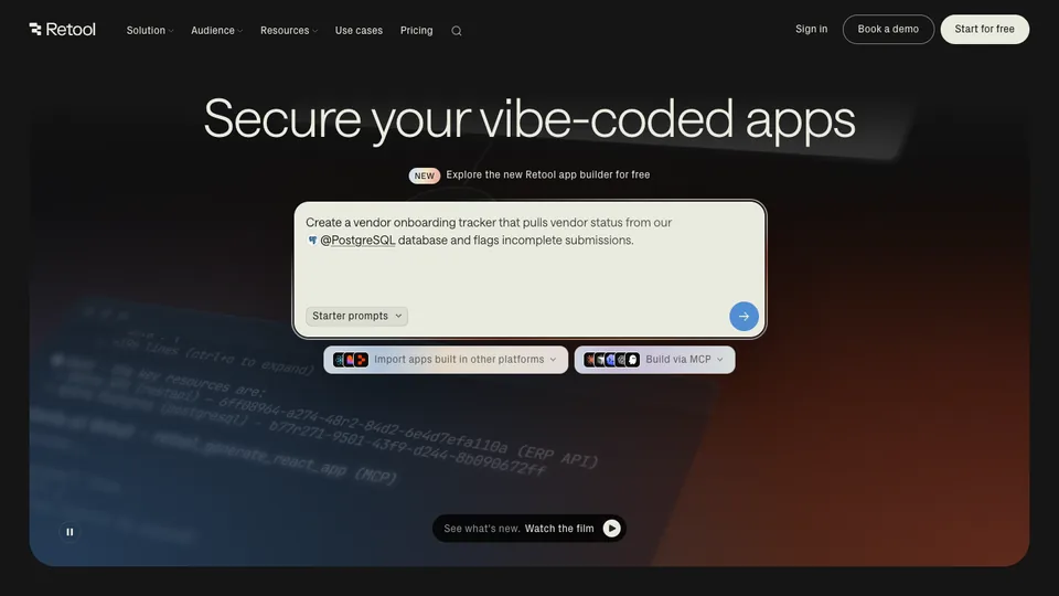
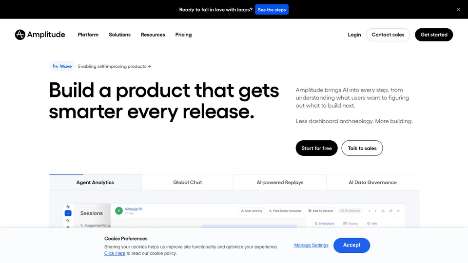
Great dashboards make dense data feel calm: a clear hierarchy, restrained colour, generous spacing, and the number you care about up front. These are product dashboards worth studying — note how each handles density, navigation and sensible defaults.

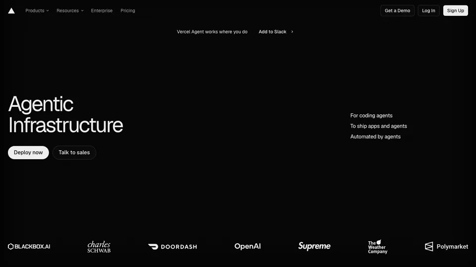
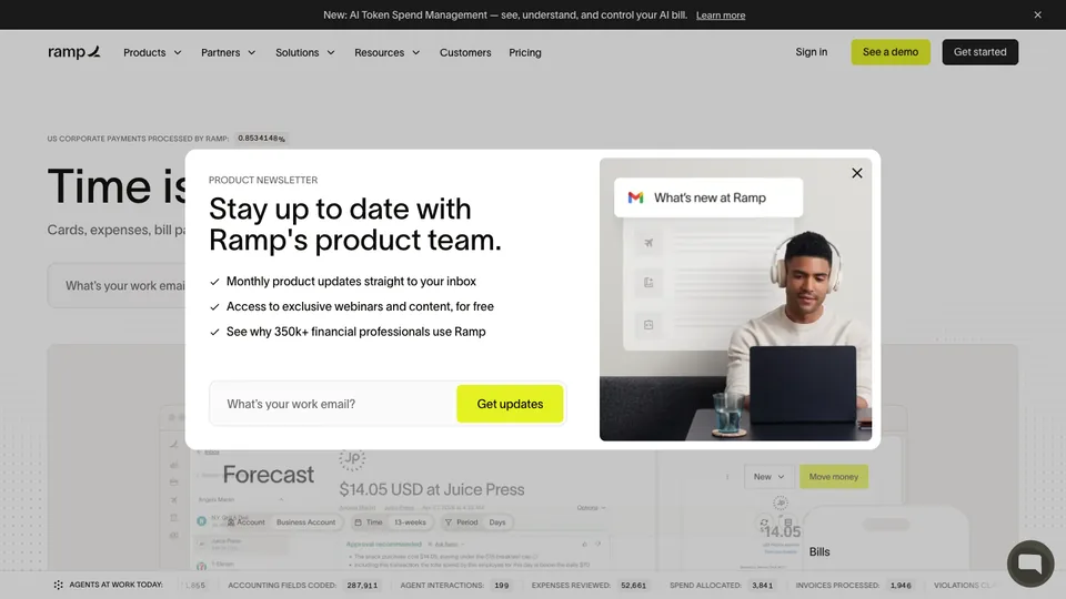
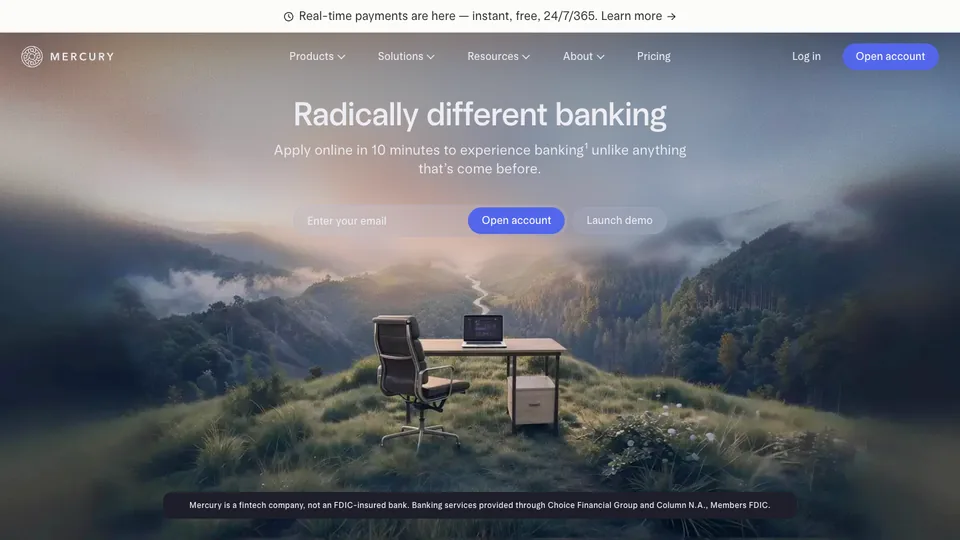
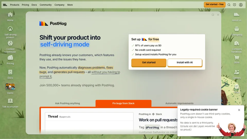
Want a site this good?
I design and build at this level on a fixed price and a fixed date — web app in 21 days, from $1,999, source code yours.
Common questions
Questions, answered
A clear hierarchy with the key metric up front, restrained colour, scannable charts, generous spacing, and thoughtful defaults and empty states. The goal is to make dense data feel calm and immediately useful.
Work with me
Want a site that belongs on this list?
I design and build launch-ready sites for founders — custom, fast, and live on your domain.
- Fixed price from $700 — no hourly surprises
- Design, build and deploy handled end to end
- 75+ projects shipped · 4.93 avg rating
More inspiration