A Practical Guide to Scalable Design Systems for Digital Products
When a company ships features rapidly, UI fragmentation occurs — three button styles, duplicate forms, disconnected navigation. A scalable design system eliminates that friction. Here's why it matters and a five-phase framework to build one.

Shaheer Malik
Framer Designer & Developer
Ever experienced three distinct button styles, duplicate form variants, and disconnected navigation patterns? When a company ships features rapidly, UI fragmentation occurs. It is a critical risk in your software development process.
And as a result, your users experience cognitive friction. Developers have to rewrite existing components, wasting precious time, slowing down the process, and making it more complex.
A scalable design system eliminates this friction. By pairing centralized, reusable components with strict engineering governance, organizations can bridge the gap between design intent and production code.
A design system creates a shared foundation for scalable digital product development. It also helps teams build faster, stay consistent, and scale with less complexity. Here's why it matters and how to build one effectively.
What Is a Design System?
Think of a design system as an operating manual for your digital products. It is a shared framework consisting of reusable components, standards, and documentation. Unlike a UI kit, it creates a common language between design and engineering teams, enabling a design that scales.
Why Scalable Design Systems are Mandatory
Scalable design systems are mandatory because they prevent design debt and inconsistency as products and teams grow. Many leading companies use design systems for scalable software development. For example, IBM's Carbon, Shopify's Polaris, and the Atlassian Design System have all proved that as products and teams grow, design systems become essential.
Core Technical and Business Advantages
- Faster releases: Teams reuse tested, production-ready components instead of building from scratch.
- Consistent UX: Centralized patterns keep experience uniform across modules and platforms.
- Lower maintenance: Fixes and updates once applied get propagated across all repositories.
- Smoother handoffs: A shared source of truth cuts testing cycles and eliminates visual regressions.
How to Build a Scalable Design System (Step-by-Step Framework)
Building a design system is generally a five-phase process spanning design, engineering, and governance. The processes involved include:
Phase 1: Discovery & Audit
Before building anything new, map what already exists.
- UI inventory mapping: Catalog every screen, component, and pattern currently in production. This surfaces every button, form, modal, and navigation variant already live in the product.
- Identify duplication: Identify duplicate components that are functionally similar but differ in appearance or behavior. This would help consolidate the code base.
- Use Figma and Storybook: Build a visual audit board in Figma, and use Storybook to catalog what's actually implemented in code. The gap between the two is usually where inconsistency lives.
Output of this phase: a prioritized list of components to standardize, ranked by how often they're duplicated or reused.
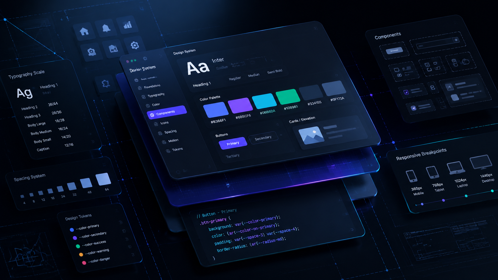
Phase 2: Design Tokens System
Design tokens are the foundation. They store core values as variables instead of hardcoded styles.
- Color: Define primitive colors (raw hex values) and map their semantics. Semantic naming lets you change a primitive value once and update it everywhere it's used.
- Spacing: Build a spacing scale (e.g., 4px, 8px, 16px, 24px, 32px) rather than arbitrary pixel values, so layouts stay visually consistent.
- Typography: Define type scale, weights, and line-heights as tokens, not per-component styles.
- Naming conventions: Adopt a consistent structure so tokens are predictable and searchable across design and code.
Tokens should live in a format. Both design tools and code can consume Figma variables synced to a JSON or CSS custom-properties file, which is the standard approach.
Phase 3: Component Architecture
With tokens in place, build the components using a structured model.
- Atomic design model: Structure components in layers.
- Atoms (buttons, inputs, labels) form molecules
- Molecules (a search bar) combine into organisms
- Organisms (a full navigation header) assemble into templates and pages.
This layering keeps components composable instead of monolithic.
- Reusable patterns: Go beyond components. Document common UX patterns like search-and-filter, multi-step forms, and empty states, so teams handle the same problem consistently, not just reuse the same button.
Build in order of usage frequency with the components used across most screens (buttons, inputs, form fields) coming first, since they deliver the highest return on standardization effort.
Phase 4: Documentation System
An undocumented design system degrades within a few sprints because teams can't use or trust what they can't understand.
- Usage rules: For every component, document when to use it, what props/variants exist, and how it behaves across states (default, hover, disabled, error).
- Do's and don'ts: Pair each component with visual examples of correct and incorrect usage. This prevents teams from misusing a component because the rules were implicit, addressing one of the most common modes of failure.
Documentation should cohabit with the components in a dedicated site like Storybook or a Figma library, not in a separate wiki that quickly becomes outdated.
Phase 5: Governance & Scaling
Most teams skip this phase, which is why design systems decay over time.
- Approval workflow: Define who reviews and approves new components or changes to existing ones, so the system doesn't fragment again the moment two teams need something slightly different.
- Version control: Treat the design system like a software package. Version its releases, document breaking changes, and let product teams upgrade deliberately instead of inheriting silent changes.
- Contribution model: Give product teams a defined path to propose new components or patterns, rather than building workarounds outside the system. A design system that can't evolve with real product needs gets abandoned in favor of one-off solutions.
Overcoming Critical Implementation Blockers
| Challenge | Impact | Strategic Fix |
|---|---|---|
| Low adoption | Teams build bespoke components to avoid friction | Give copy-paste snippets and sandboxes and make the system easier than raw code |
| Design-code drift | Apps stop matching mock-ups as code evolves | Sync Figma and Storybook via CI/CD; enforce simultaneous updates on PRs |
| System atrophy | The library goes stale without upkeep | Treat it as a funded product with dedicated owners |
Conclusion
Scalable design systems are infrastructure, not design assets. Organizations that invest in tokens, governance, and reusable components build a more efficient software development process.
The goal may be localized growth or complex enterprise software development. Either way, the objective stays the same. Automated tokens, clear atomic hierarchies, and strict governance build a system that evolves alongside your business.
FAQs
Q1: What is the role of design tokens in a scalable system?
Design tokens are variables that store your colors, fonts, and spacing. Instead of hardcoding values everywhere, you change them once and it updates across your entire product.
Q2: How do we prevent a design system from becoming rigid or outdated?
Don't build it and abandon it. Keep it flexible, listen to feedback from real users, and update it regularly. Treat it as a living thing that grows with your product.
Q3: How does a scalable design system improve collaboration between design and engineering?
It creates a shared language. Designers and developers work from the same components and rules, so there's less confusion, fewer misunderstandings, and faster teamwork.
Q4: When is the right time for a startup or product team to build a design system?
Start early, even informally. When you notice the same components being built multiple times, that's your signal. You don't need to wait until you're huge.
Q5: How do you measure the ROI of a design system?
Track faster feature releases, reduced development time, quicker onboarding for new team members, and fewer bugs. Companies typically see productivity improvements from strong design systems.
References
Need this kind of work for your product?
I design and build websites, products, and brands for SaaS & AI startups — design and code under one roof.