Color Theories & Color Systems: Understanding RGB / RYB and the 3 Primary Colors
Ever wondered why yellow and blue make green in paint, but red and green make yellow on a screen? This blog unpacks the mysteries of color theories and color systems, diving deep into the science behind RGB and the 3 primary colors. Whether you're mixing paints or pixels, discover how additive and subtractive color mixing work, and how understanding primary colors can supercharge your creative toolkit.

Shaheer Malik
Framer Designer & Developer

Color is everywhere – in art, in nature, in the glow of our screens – and it evokes emotions and creativity. But color theories and color systems can sometimes feel a bit confusing, right? Remember learning about the 3 primary colors in art class? Red, yellow, and blue were presented as the magic trio: mix them in different ways and you could create all other colors on the color wheel. Many of us happily painted with this idea, swirling yellow and blue to get green, adding red to get purple, and so on.
For the quick version first, here is a simple breakdown of primary, secondary, and tertiary colors.
Then, later on, we encounter the world of computers and televisions using RGB light. Suddenly the primary colors are red, green, and blue – wait a second, green instead of yellow? And mixing colored light follows different rules entirely: combining red and green light gives you yellow, and adding blue light into the mix can actually make white light! If you're scratching your head, you're not alone.
Understanding Primary Colors: The Basics
It turns out there are different color models and color theories at play, and context matters – whether you're mixing paint or mixing stage lighting or designing a digital display.
What Are Primary Colors?
In color theory, the concept of primary colors refers to a foundational set of colors that can be used to mix a wide range of hues. Think of them as the building blocks of all other colors. Typically there are 3 primary colors in any given color system. The key is that these colors are "primary" because they cannot be created by mixing any other colors together. Instead, by combining these primaries in various proportions, artists and designers can create a wide range of hues and shades.
Traditional Color Theory (RYB)
In traditional color theory, i.e. red, yellow, and blue are the primary colors. In this system, you simply can't mix any other paints to get a pure red, a pure yellow, or a pure blue – they have to start out as those primaries. All the other colors on the classic artist’s color wheel – the purples, greens, oranges, and so on – are created by mixing these primary colors in different combinations.
Different Color Models
There are several different color models, each with their own set of primaries:
RYB (red, yellow, blue) for traditional pigments
RGB (red, green, blue) for light
CMY (cyan, magenta, yellow) for inks
The differences between these sets come down to how the color mixing is happening – whether it's with light or with physical pigments. But whichever model you use, the idea is the same: using a small set of primary colors, you can combine them to create essentially every other color you'll need.
Additive AND Subtractive Color: Two Color Systems Explained
Additive Color Mixing (Light)
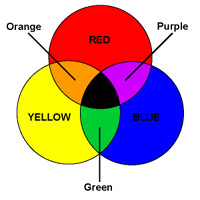
Additive color mixing happens when we mix colored light sources. Imagine overlapping three spotlights – one red, one green, one blue – on a white wall. Where two lights overlap, you see a new color (mix red and green and you get yellow light, for example). Where all three overlap, you get white light, since you're basically combining all wavelengths of light together (as Isaac Newton showed by recombining the rainbow back into white).
In an additive system like RGB or additive primary colors, the more colored light you add, the brighter and closer to white the result becomes. Red light, green light, and blue light are the primary colors here, and they can mix in different amounts to create a wide range of other colors. This is how your computer or TV screen works: tiny light sources in red, green, and blue blend to produce the images you see. If you zoom in close to a screen, you can actually see those primary-colored pixels.
Additive mixing is intuitive if you think about wavelengths of light. Each primary color of light adds its energy to the mix, and our eyes interpret the combined wavelengths as new colors.
Subtractive Color Mixing (Pigment)
Subtractive mixing is what happens when we mix paints, inks, or dyes – basically, pigments. Here, colors mix by absorbing (subtracting) certain wavelengths of light and reflecting others. Think of mixing all your paint colors together on a palette: the more colors you mix, the muddier or darker the color gets. That's subtractive color.
In a subtractive system, you start with white light (like daylight or a white page) and each pigment you add removes (absorbs) some colors of that light. For example, yellow paint looks yellow because it absorbs blue light and reflects the rest; blue paint absorbs yellow and red light. When you mix yellow and blue paint, what's left? The blue paint absorbs the red and yellow portions of the spectrum, and the yellow paint absorbs the blue portion. The only light not absorbed is green, so the mixture appears green.
The more pigments you mix, the more of the spectrum gets absorbed and the closer you get to black or a dull brown. (If you mix all three primary paint colors together, the result is a very dark, muddy color – basically black.)
Subtractive Primary Colors (CMY)
In subtractive color models used for printing, the primary colors – often called the subtractive primary colors or subtractive color system – are slightly different: cyan, magenta, and yellow. Cyan absorbs red light, magenta absorbs green, and yellow absorbs blue. (This CMY set, with the addition of black (K), is the subtractive color model used in the printing industry.)
This CMY scheme is essentially the "opposite" of the RGB scheme, and it produces a larger range of color mixtures than the RYB system when used in inks. In fact, the red, yellow, and blue paints we use in art are a rough approximation of the ideal subtractive primaries; cyan is like a bluish-green, and magenta a purplish-red.
Many art teachers stick with RYB because it's simple and traditional. However, in terms of physics, the CMY system aligns more neatly with RGB (each subtractive primary absorbs one of the additive primaries).
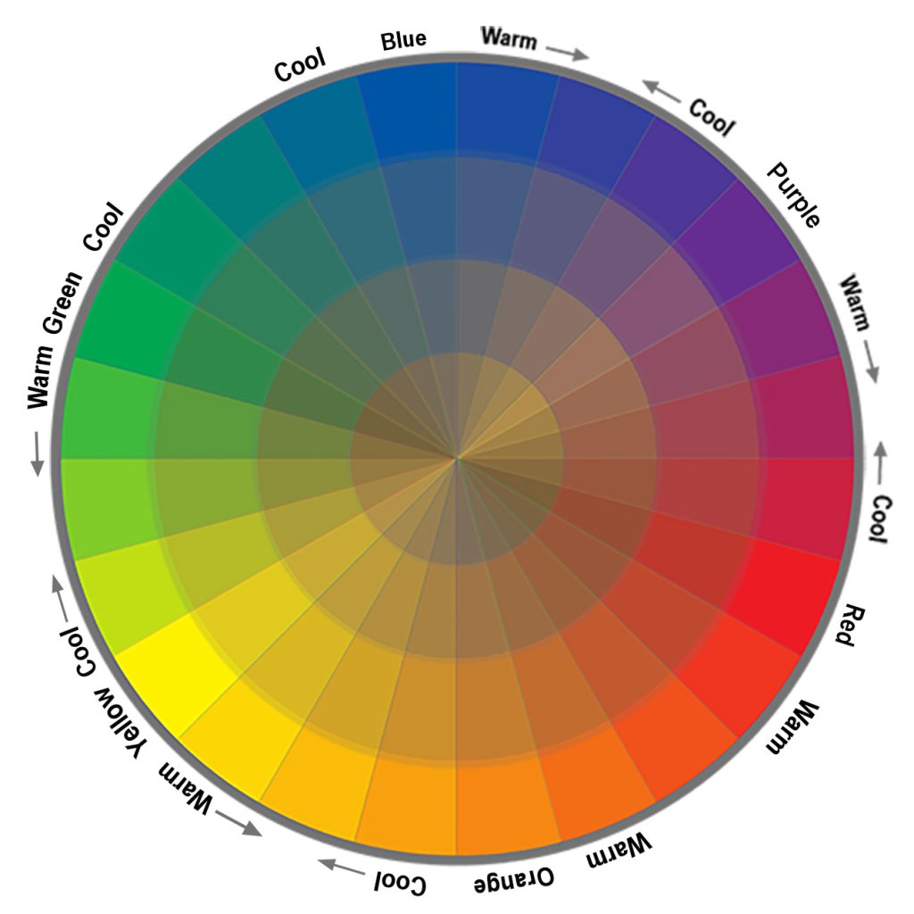
Color Mixing and the Color Wheel
The Artist's Color Wheel
If you took an art class, you likely encountered the color wheel – a handy visual tool that maps out colors and their relationships. One common version is based on the traditional RYB model. In a classic artist’s color wheel, the 3 primary colors (red, yellow, and blue) are spaced evenly around the circle. Between each pair lies the secondary color formed by mixing those primaries:
Red + Yellow = Orange
Yellow + Blue = Green
Blue + Red = Purple
It also includes tertiary colors – those in-between hues like red-orange or blue-green – which are created by mixing a primary color with a neighboring secondary color.
Warm and Cool Colors
On the color wheel, you’ll often hear about warm and cool colors. Generally:
Warm colors: Reds, oranges, and yellows (energetic or fiery)
Cool colors: Blues, greens, and purples (calm or icy in vibe)
This isn’t a rigid science, but it’s a helpful way to think about the mood of a color scheme.
Complementary Colors and Contrast
Understanding how colors interact on the wheel is crucial. Complementary colors (opposites on the wheel, such as blue and orange) make each other appear brighter when placed side by side. Knowing that lets you use color contrasts effectively.
Primary Colors in Digital Design: The RGB Model
The Science Behind RGB
Why do we use three primary colors, and why specifically red, green, and blue for light? The answer lies in color science and how our eyes work. Human color vision is based on three types of cone cells in our eyes. Each type of cone is sensitive to a different range of light wavelengths – roughly corresponding to red, green, and blue light.

Essentially, our brain mixes the signals from these three cone types to produce the perception of all the colors we see. For example, we don’t have a specific cone for “yellow” light; instead, when our red and green cones are stimulated together, we perceive yellow. This is why the additive primaries are red, green, and blue – by blending these, we can trigger our cones in combinations that make us see virtually any color.
RGB Displays and Color Reproduction
An RGB display (like a TV, computer, or phone screen) takes advantage of this. Each pixel on the screen has tiny red, green, and blue sub-pixels. By adjusting the brightness of those, the screen can “mix” the light and trick your eyes into seeing a wide range of colors.
In fact, just three colors (RGB) mixed in different intensities can create millions of distinct hues our eyes can discern.
Color Management Across Devices
Color on a screen (RGB) may look different in print (CMYK). Understanding color management helps keep colors consistent. Because of these differing primary color models, a bright teal on your laptop might print out looking a bit dull or shifted unless adjustments are made.
Thanks to standard calibration tools, a designer can ensure consistency across media. The bold orange background they see on screen (created with light) will still look orange and vibrant when printed with ink.
Using Primary Color Space
Real-World Use Cases
Designers: Use the RGB color system for screens, CMYK for print.
Artists: Master subtractive color mixing to create stunning colors in art.
Teachers: Introduce the concept of primary colors with hands-on mixing sessions.
Creating a Color Palette
Start with primary colors, then mix in secondary and tertiary colors to build a color palette. This gives your designs structure and flexibility.
Many famous painters and designers have deliberately limited their palettes to primary colors to explore the range that can be achieved. For example, Piet Mondrian famously limited his color palette to just the primary colors (red, blue, yellow) plus black and white. This approach created paintings with bold primary blocks that feel balanced yet dynamic.
Final Thoughts: The Power of Three Colors
From finger painting in kindergarten to fine-tuning a professional monitor, the idea of primary colors connects so many experiences of color in our lives. In the end, whether you’re talking about paint, light, or ink, it all comes down to a few fundamental hues.
The three primary colors truly are the building blocks from which all other colors are derived. Mix them, blend them, experiment with them – suddenly you have a whole rainbow at your disposal. It's almost like magic when you think about it.
Understanding these principles isn’t just a dry theory – it’s a practical superpower for anyone who works with color. When you know the role of primaries, you can use colors effectively, mixing and matching with confidence. You can predict how to create new colors or why a certain combination isn’t yielding the hue you expected.
You can appreciate why a digital design might need tweaking to look the same in print. This knowledge bridges the gap between different mediums and ensures your creative intent carries through.
Most importantly, appreciating primary colors can deepen your enjoyment of the visual world. The next time you admire a brilliant orange sunset fading into a blue night sky, you’ll recognize the subtle dance of primaries at play.
In a very real sense, primary colors are the language that both our art and our technology speak when they want to tell a colorful story. Understand that "language" – the concept of primary colors behind different color systems. It equips you to see more, create more, and communicate more through color.
And ultimately, life is a lot more interesting and beautiful when you can see how the pieces of the color puzzle fit together. So go ahead: experiment with that palette, play with that lighting, and let those primary colors work their magic. You now know the secret – that three simple colors can unlock a wide range of colors across the spectrum – and that’s a pretty wondrous thing.
Need this kind of work for your product?
I design and build websites, products, and brands for SaaS & AI startups — design and code under one roof.